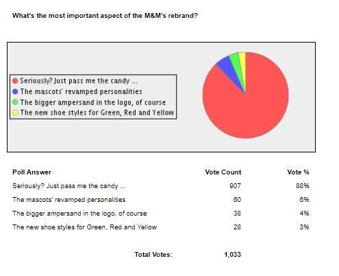
I ran this poll (and got these results) in the “While You Were Working” newsletter from Smartbrief last Thursday:
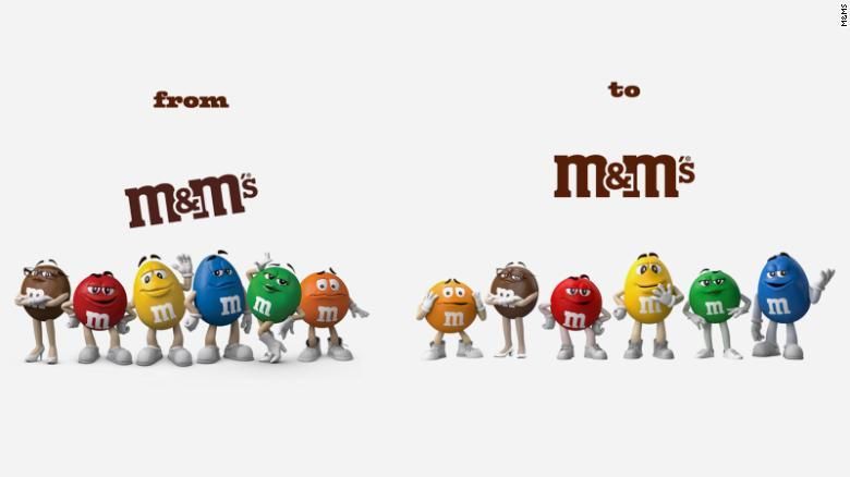
The poll had to do with the fact that the M&M’s characters and logo are changing. The overarching idea, according to Mars, their owner, is to “reflect the more dynamic, progressive world that we live in.” Read their full statement here.
I particularly like how they made the ampersand in their logo more pronounced “to more prominently demonstrate how the brand aims to bring people together.”
Do people care about whether spokescandies tie their shoes?
Among the changes? Orange now has shoes that are tied. Yellow and red got shoelaces. Green lost her boots and got sneakers.
I’m not sure how Orange’s tied shoes make Orange more inclusive.
And apparently, 88% of more than 1,000 people who answered my poll didn’t care either.
Personal friends who I asked about this, on the whole, didn’t care.
Commenters to the video …
… either didn’t care or were downright antagonistic.
As I told one friend, I wonder what the meeting room was like where all of this was being hashed out.
I have some questions about the characters’ bios.
Blue, for example, when asked who they would meet if they had an opportunity to meet “anyone dead or alive,” responded, “I’d rather meet people who are alive. With dead people you really have to carry the conversation.” Sarcasm from a candy struck me as strange.
My two cents
This choice by Mars may be the woke corporate pandering that plenty of people say it is.
I’m not sure I agree with the execution (are shoes really that important?), but I am in the camp of applauding M&Ms for trying. (I also probably need to send their social media team flowers or something, because I’m guessing they have had an intense time since the January 20 announcement).
Maybe this process only helped the M&M’s staff members who had to figure it all out, without enlightening anyone in the general public. If it was only that, then there are that many more people in our world who thought about diversity and making sure every consumer feels respected. That alone is a good thing.
What do we want? Plain packaging with zero originality?
Being original is risky, and there will be foibles, but trying is worth it.
It’s worth it and increasingly expected. A Channel Factory survey found that “60 percent [of people surveyed] prefer firms want to see diversity and inclusion in the brands they do business with.” (Read more here about consumer expectations of how companies will share values.)
I also like the fact that M&M’s is creating the M&M’s FUNd to provide opportunities for artists and creatives.
Stepping away from the characters for a moment, let’s address the changes to the logo.
I particularly like how they made the ampersand in their logo more pronounced “to more prominently demonstrate how the brand aims to bring people together
Here are the changes all in one place.

The other modification to the logo is that it is straight now, something I’ve heard and read zero complaints about. I hope no one made it to go confectionary conversion therapy.
Just for fun, remember when it was all easier?
This post is a response to the Kat Bouska prompt “Write a blog post inspired by the word ‘change.'”

Wife of one, Mom of two, Friend of many. My pronouns are she/her/hers.

A charming post. I think with all the down info in the world today, this is rather fun. Though I never noticed their shoes!!
The fixation with the shoes fascinates me.
I applaud companies who try. (Though I have to admit these changes would have passed unnoticed by uber-observant me if you hadn’t pointed them out!) 😉
Ha! You’re welcome, I guess?!